

One Wix page with nav links that 404’d, rebuilt as eight real ones.
Heirs 2 U make bespoke fine jewelry in limited runs. Their site was one of the first Joseph ever built, and it had been a single page for years.
You get Joseph Deep — not a call center. The assistant answers at 2am; I answer the phone.
Prefer email?Joey@deepdevelopmentanddesign.com
What was actually there
A single-page Wix build. The nav across the top read Services, Exclusive Design, Gallery — but none of those were pages. They were anchors that scrolled you down the same page, and typing /services into the address bar returned a Wix 404. Everything the business does well, including the thing that makes them different from every other jeweller, was compressed into one long scroll with nowhere to link to.
Eight pages, checked at three widths.
Captures taken at 1,440, 834 and 390 pixels wide — the site’s own breakpoints firing, not one picture squeezed into three shapes. Scroll inside the frame to read the whole page.
Captured
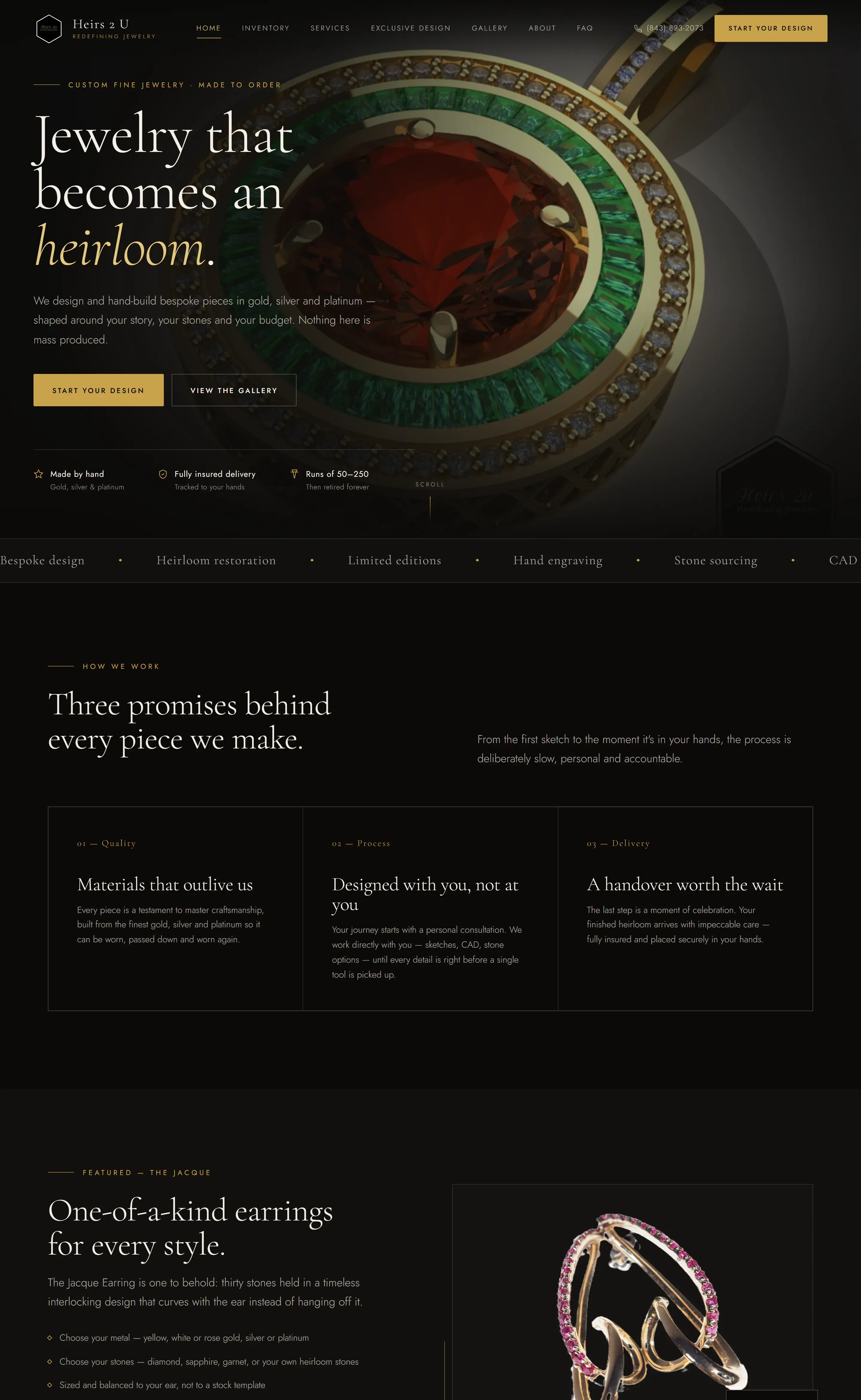
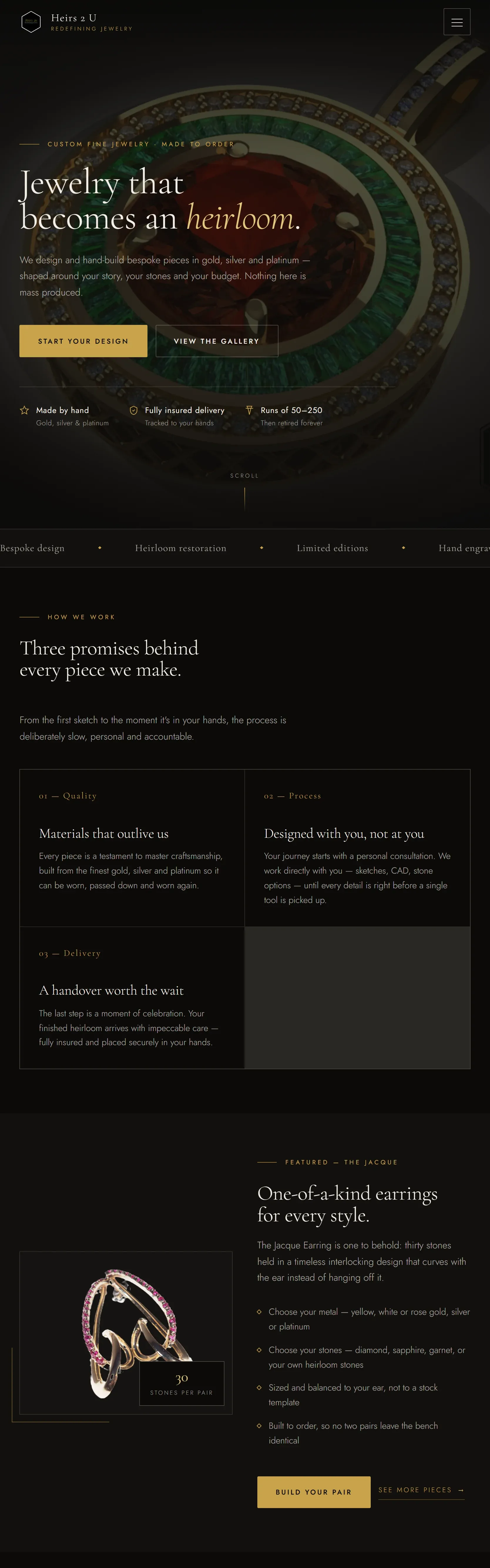

Shown at about a quarter size — open the real site to read it.
↑ Dark warm-noir, pulled from their own hexagon logo — near-black, ivory and gold, with cream sections breaking the run so the dark never becomes a void.
This is a frozen capture from 25 August 2026, not a live window — so it shows what we delivered. See Heirs 2 U as it is today →
What we built
Plain HTML, CSS and JavaScript. No framework, no build step, no dependency that can rot — a jeweller should not need a Node upgrade to change a phone number.
Eight real pages, each with a real URL, plus a designed 404 rather than the platform’s. Home, services, exclusive design, gallery, about, FAQ, contact and inventory — so every nav item finally goes somewhere.
A page for the thing that makes them different. Runs of 50 to 250 pieces, then discontinued forever, and the original artist earns a share of every sale. That is the whole business, and it had nowhere to be explained.
A 24-piece filterable gallery with a keyboard lightbox. Eight categories, arrow keys to move, Escape to close, and focus goes back where it came from.
Their own inventory, embedded rather than rebuilt. The showcase system they already pay for now has a page of its own instead of living somewhere else entirely.
A quote form that reaches somebody. It validates, writes the inquiry to the same database their client dashboard reads, and emails it. It worked with no backend at all first, so it was never broken while the backend was being built.
How it got made
Carry across what is true
The tagline, the phone number, the four services, the named pieces, the one real testimonial. Nothing about the business was invented to fill a layout — where a fact was missing it stayed missing rather than becoming a plausible sentence.
Color from their own logo
Near-black, ivory and gold, sampled off the hexagon mark they already had, rather than chosen. A brand that already exists does not need a new one; it needs the one it has, used properly.
Checked, not assumed
No sideways scroll at 390, 768 or 1440. Zero broken images. Every link answered 200. Structured data for a jewelry store and for the FAQ, so a search engine and an assistant read the same page a person does.

A rebuild is mostly reading the old site properly
Before a line was written, all 28 photographs were pulled back at full resolution and every claim on the old page was checked against what the business actually does. One image had been mislabelled for years.
The services behind it
Does your nav go anywhere?
If your navigation points at anchors instead of pages, you are invisible for every search except your own name. Tell us what you sell and we will show you what it should look like.